Plotting taxonomic data
Throughout this workshop we will be making many familiar types of
graphs using ggplot2 and we will explain how they are made
as we go. In this section however, we will focus on using the
metacoder package to plot information on a taxonomic tree
using color and size to display data associated with taxa.
Taxonomic data can be difficult to graph since it is hierarchical. For example, if you have abundance information for each taxon and want to graph it, what kind of plot do you use? Stacked bar charts and pie graphs are common choices, but these ignore the hierarchical nature of the data; typically only a single rank is graphed. For example the graph below is from the publication (see Wagner et al. 2016) that described the data set we are working with:
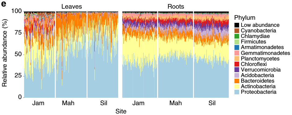
Although this is a well-constructed graph, its usefulness is limited by the nature of stacked barcharts. The reliance on color to differentiate taxa means that the maximum number of taxa that can be effectively displayed is limited by the number of colors that can be distinguished. This is typically around 10, maybe 13 with careful selection (as in the graph above), but definitely not more than 15. For those who are color blind (~ 4% of people), even fewer colors can be used. This limitation is likely the reason Wagner et al. (2016) chose to show phylum-level abundances and grouped some phyla into a “Low abundance” category, even though there might be interesting pattern in finer ranks (e.g. genus or species). This is typical of most publications, which either show only the most coarse ranks (e.g. phylum) or only the ~10 most abundant taxa when using stacked barcharts. As an alternative/complement to stacked barcharts, we have developed what we call “heat trees” to display statistics associated with taxa (e.g. abundance) in a tree format.
Load example data
If you are starting the workshop at this section, or had problems
running code in a previous section, use the following code to load data
used in this section. You can download the “filtered_data.Rdata” file
here.
If obj and sample_data are already in your
environment from a previous section, you can ignore the following
command.
load("filtered_data.Rdata")Heat trees
The metacoder package implements “heat trees” to graph
taxonomic data (Foster, Sharpton, and Grünwald
(2017)). This visualization technique uses the color and size of
parts of a taxonomic tree to display numeric data associated with taxa.
Below is an example of a heat tree showing the number of
Operational
Taxonomic Units (OTUs) in all taxa down to the class rank:
library(metacoder)
obj %>%
  filter_taxa(grepl(pattern = "^[a-zA-Z]+$", taxon_names)) %>% # remove "odd" taxa
  filter_taxa(taxon_ranks == "o", supertaxa = TRUE) %>% # subset to the order rank
  heat_tree(node_label = gsub(pattern = "\\[|\\]", replacement = "", taxon_names),
            node_size = n_obs,
            node_color = n_obs,
            node_color_axis_label = "OTU count",
            layout = "davidson-harel", initial_layout = "reingold-tilford")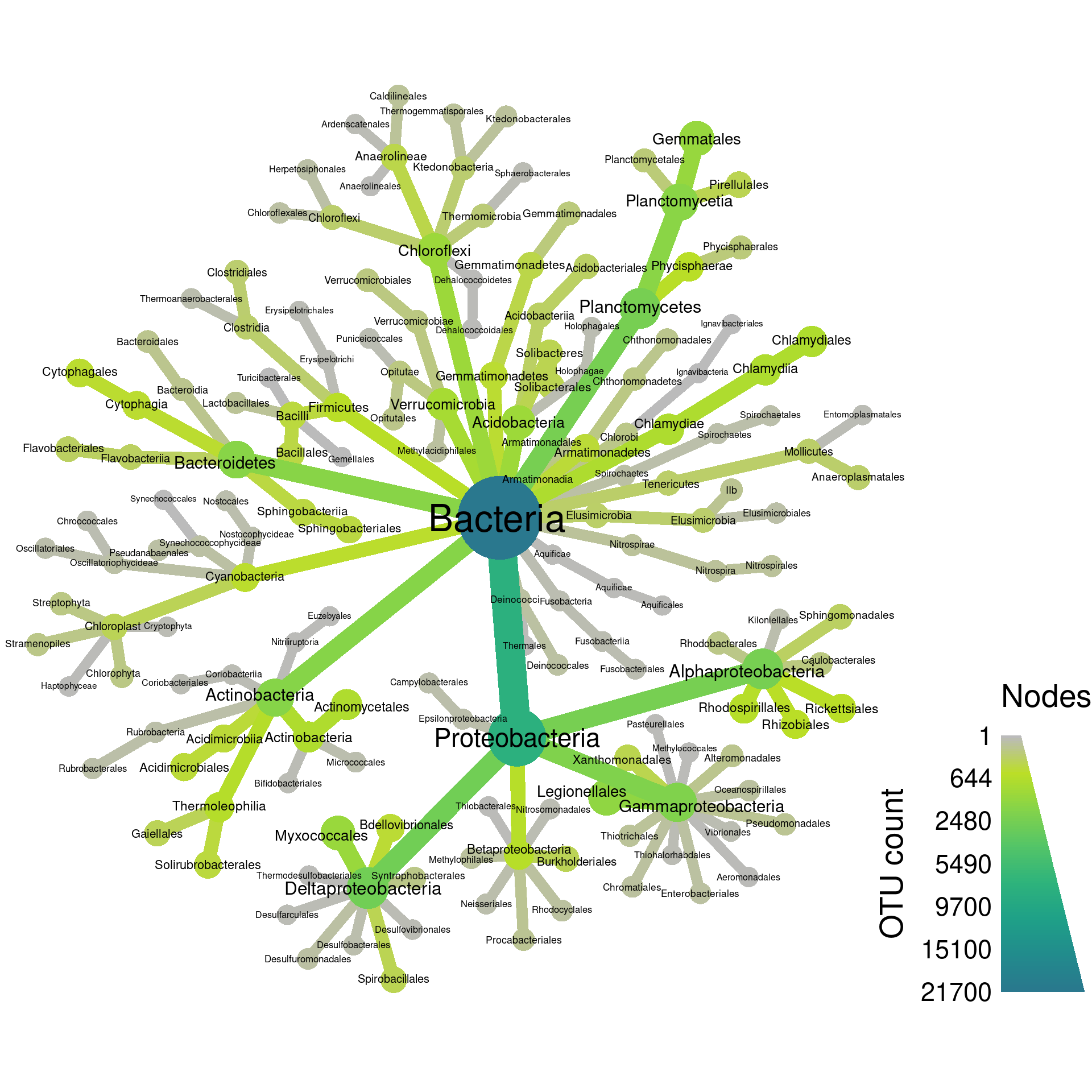
This is a type of taxonomic tree in which each node (the circles) is a taxon and the edges (lines) show hierarchical relationships between taxa. For example, the large Proteobacteria phylum node contains the Alphaproteobacteria and Gammaproteobacteria classes. This is a relatively small heat tree meant as a demonstration; much larger and more intricate ones are possible. We are going to go through the process of creating figures like this one in this section. Although this might seem like complicated code to make this figure, code like this is typically the result of iterative small improvements started from a simple base. We will imitate this process here for demonstration.
Getting started
The heat_tree function takes a taxmap
object as its first argument. Lets start with the simplest possible
code:
heat_tree(obj)
This is not too useful, but at least its easy! Lets plot some data to make things more interesting. A good place to start is to plot the number of OTUs (or other types of taxon observations) with both the color and size of nodes. The taxon names are added here as well.
heat_tree(obj,
          node_label = taxon_names,
          node_size = n_obs,
          node_color = n_obs)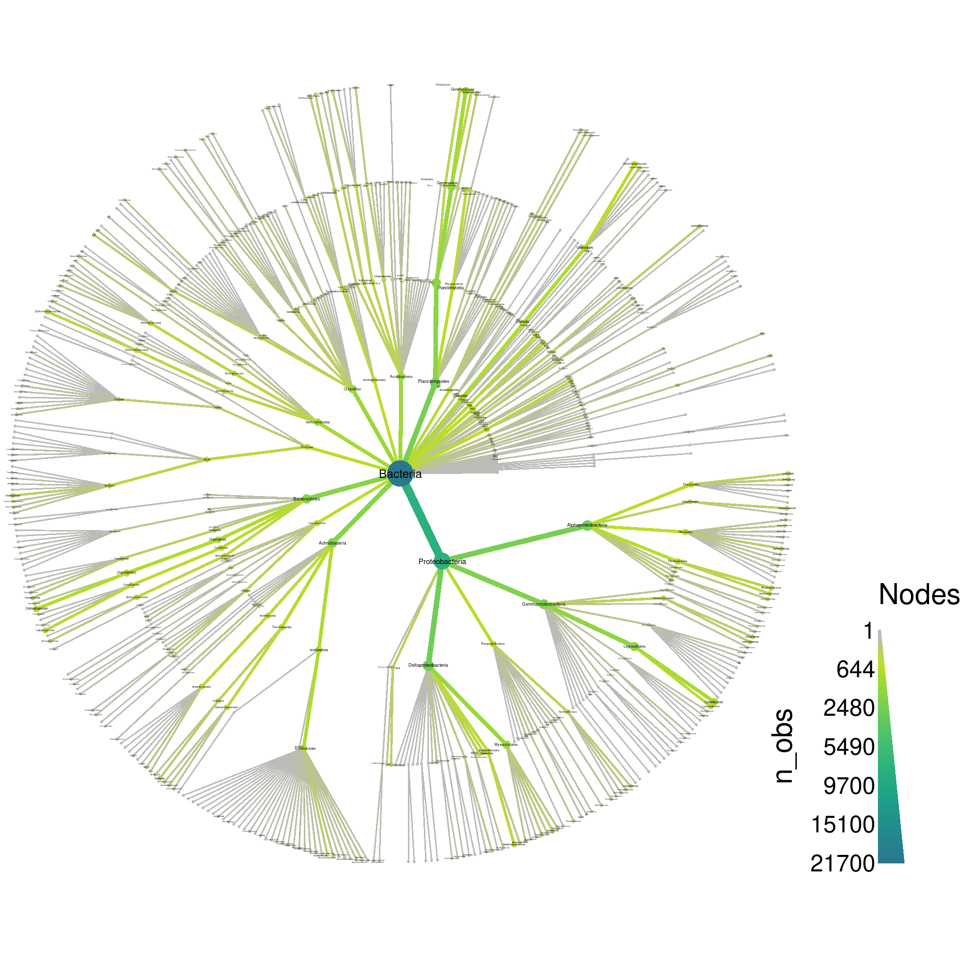
As with many other functions from metacoder, any table
column or
function
associated with the taxmap object being plotted can be
refereed to as if it was an independent variable in the function call
using
Non-standard
evaluation (NSE). For example, the last plot could also have
been made this way:
heat_tree(obj,
          node_label = taxon_names(obj),
          node_size = n_obs(obj),
          node_color = n_obs(obj))
The default layout is pretty cluttered with this amount of taxa (704), so the labels are not readable without saving the graph as a PDF and zooming in. With enough tweaking, we probably could make a tree with all 704 taxa that looks good without a PDF viewer, but for this demonstration, we will try to make a plot that could be used in a publication with minimal zooming. So, lets remove all taxa below the order rank to cut down the number of taxa displayed. We will also save the output as a PDF so we can take a closer look at the output.
obj %>%
  filter_taxa(taxon_ranks == "o", supertaxa = TRUE) %>% # subset to the class rank
  heat_tree(node_label = taxon_names,
            node_size = n_obs,
            node_color = n_obs,
            output_file = "plot_example.pdf")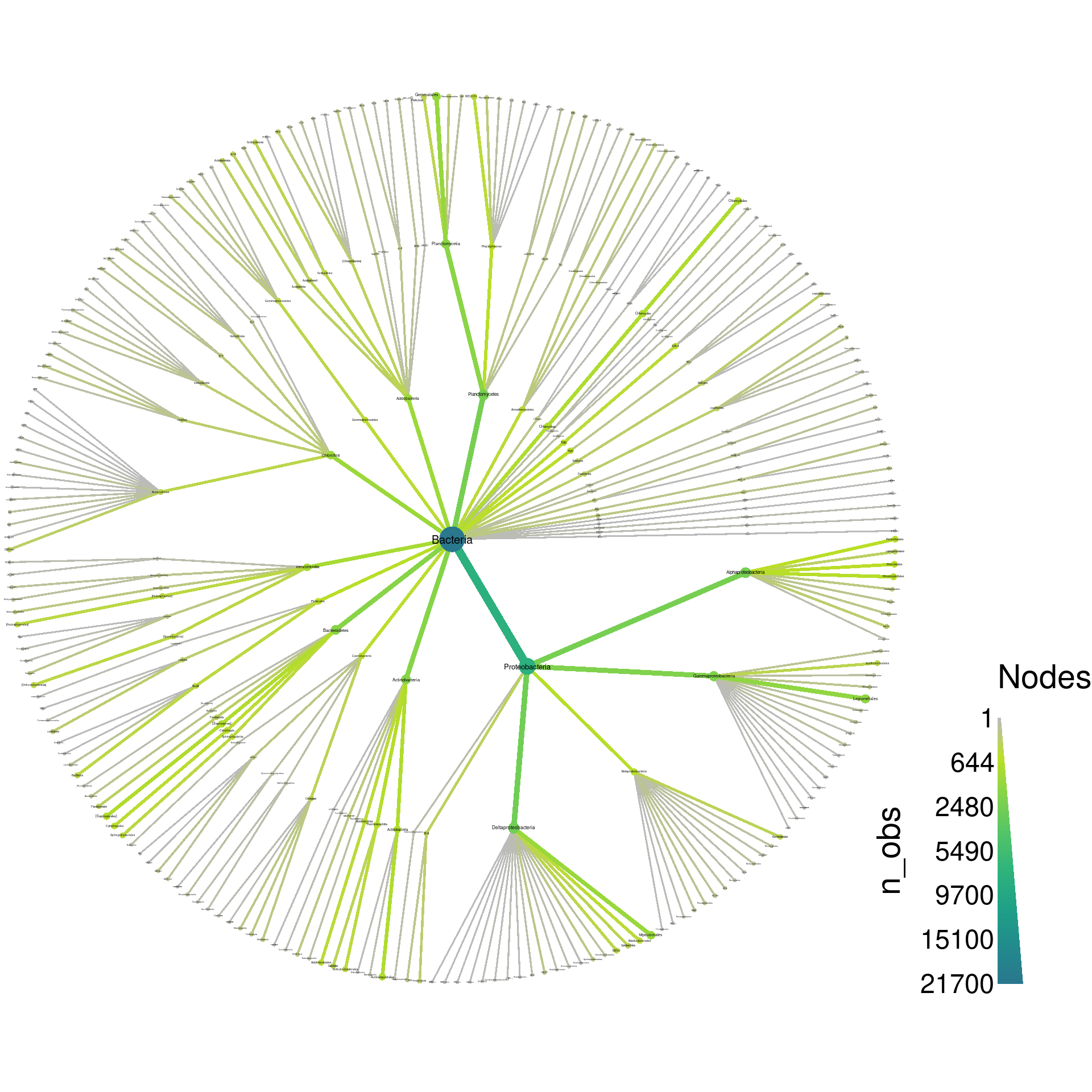
If we zoom in on the output, we can see a lot of taxa with odd names like “Ellin329” and “BD7−3”. During analysis such taxa might be important to see, but for publication purposes, most can probably be removed from the plot to make it easier to understand. We can filter those taxa out before plotting using a regular expression that only matches letters:
obj %>%
  filter_taxa(grepl(pattern = "^[a-zA-Z]+$", taxon_names)) %>% # remove "odd" taxa
  filter_taxa(taxon_ranks == "o", supertaxa = TRUE) %>% # subset to the class rank
  heat_tree(node_label = taxon_names,
            node_size = n_obs,
            node_color = n_obs,
            output_file = "plot_example.pdf")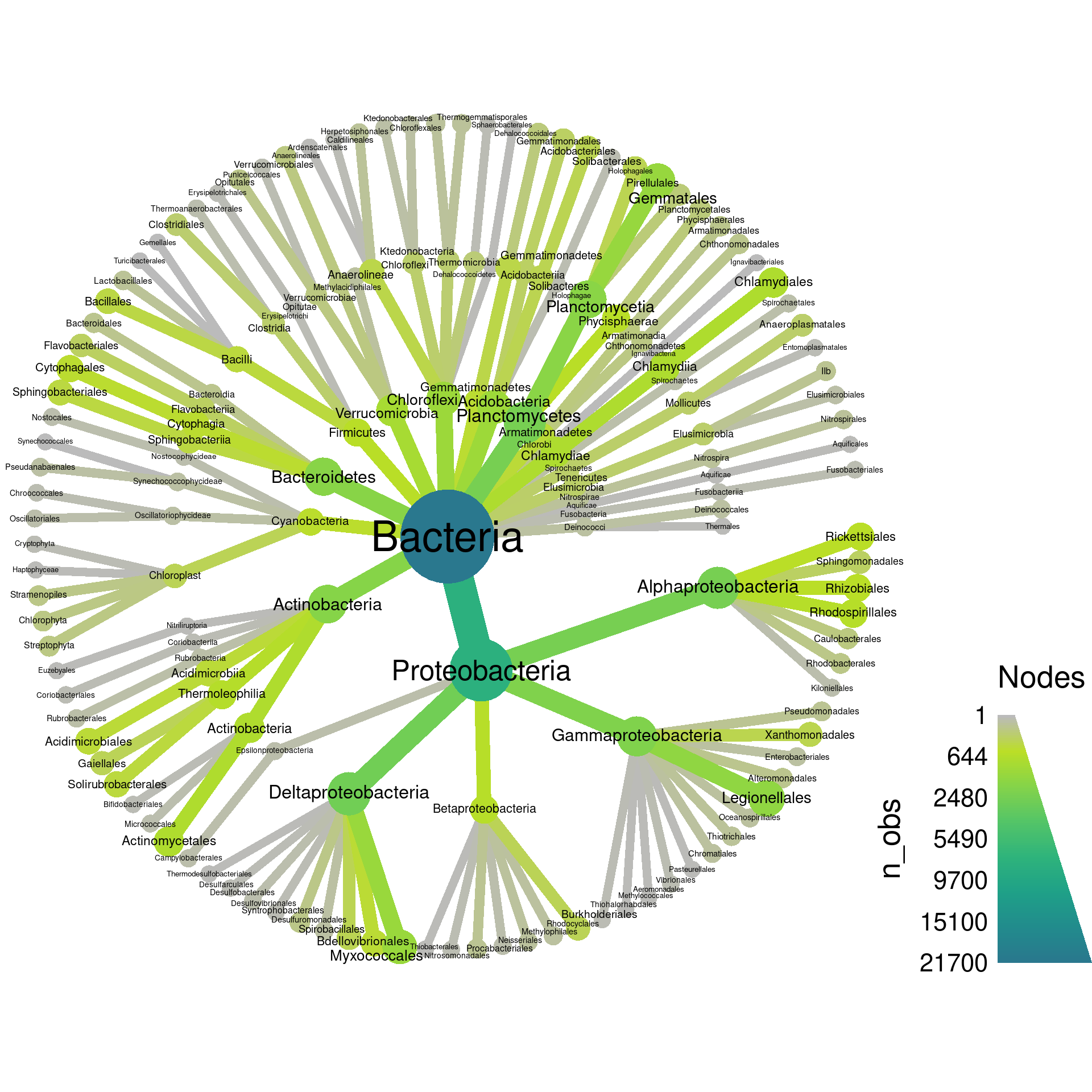
Now we are getting to something more understandable. Lets play with the layout to see if we can find one that spaces things out better. There are lots of layouts available, but only few produce reasonable results most of the time. Some of the better ones for this use include:
- reingold-tilford (the default)
- davidson-harel
- fruchterman-reingold
See ?heat_tree for a complete list. You only need to use
the first few letters of each name. Lets look at these other two
formats. First, fruchterman-reingold:
obj %>%
  filter_taxa(grepl(pattern = "^[a-zA-Z]+$", taxon_names)) %>% # remove "odd" taxa
  filter_taxa(taxon_ranks == "o", supertaxa = TRUE) %>% # subset to the class rank
  heat_tree(node_label = taxon_names,
            node_size = n_obs,
            node_color = n_obs,
            layout = "fr",
            output_file = "plot_example.pdf")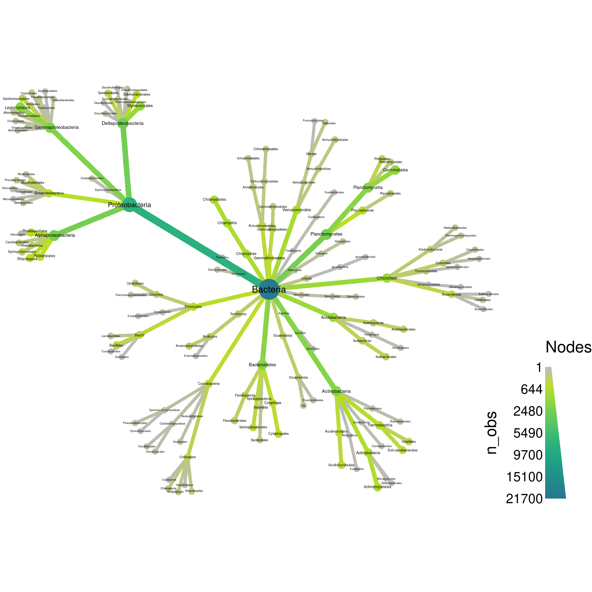
These types of layouts have a random component to how they are made, so running the same code twice will produce different layouts. Try running the above code again to see this. We can force it to be the same each time by setting the seed for the random number generator used by R before each plot, as is done in the next example. The last layout is not too bad, but does not make good use of space. Lets try davidson-harel:
set.seed(1) # Each number will produce a slightly different result for some layouts
obj %>%
  filter_taxa(grepl(pattern = "^[a-zA-Z]+$", taxon_names)) %>% # remove "odd" taxa
  filter_taxa(taxon_ranks == "o", supertaxa = TRUE) %>% # subset to the class rank
  heat_tree(node_label = taxon_names,
            node_size = n_obs,
            node_color = n_obs,
            layout = "da",
            output_file = "plot_example.pdf")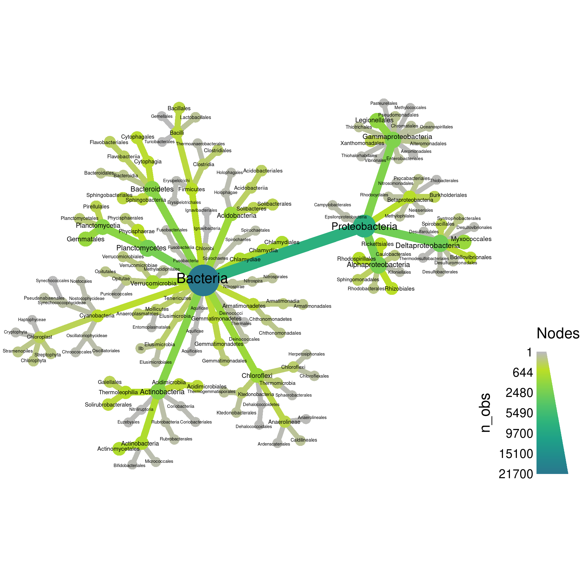
That’s a bit better, but there is one more thing we can try. The
heat_tree functions allows you to set an “initial” layout
that is used as the starting point for these other layouts. We have
found the combination of “reingold-tilford” and “davidson-harel” to be
space-efficient for large plots.
set.seed(2) # Each number will produce a slightly different result for some layouts
obj %>%
  filter_taxa(grepl(pattern = "^[a-zA-Z]+$", taxon_names)) %>% # remove "odd" taxa
  filter_taxa(taxon_ranks == "o", supertaxa = TRUE) %>% # subset to the class rank
  heat_tree(node_label = taxon_names,
            node_size = n_obs,
            node_color = n_obs,
            initial_layout = "re", layout = "da",
            output_file = "plot_example.pdf")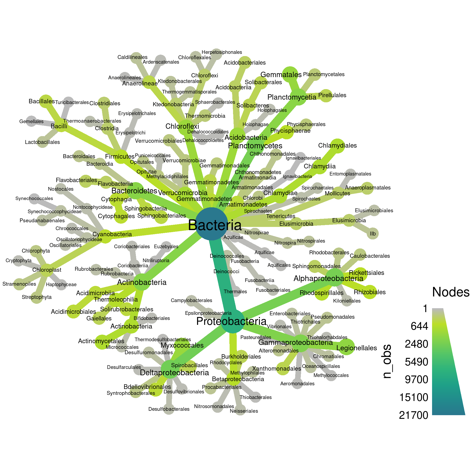
Up until now, we have set both the color and size to display the number of OTUs, but they can be set to different things. Lets set the color to the number of supertaxa that each taxon is included in.
set.seed(2) # Each number will produce a slightly different result for some layouts
obj %>%
  filter_taxa(grepl(pattern = "^[a-zA-Z]+$", taxon_names)) %>% # remove "odd" taxa
  filter_taxa(taxon_ranks == "o", supertaxa = TRUE) %>% # subset to the class rank
  heat_tree(node_label = taxon_names,
            node_size = n_obs,
            node_color = n_supertaxa,
            initial_layout = "re", layout = "da",
            output_file = "plot_example.pdf")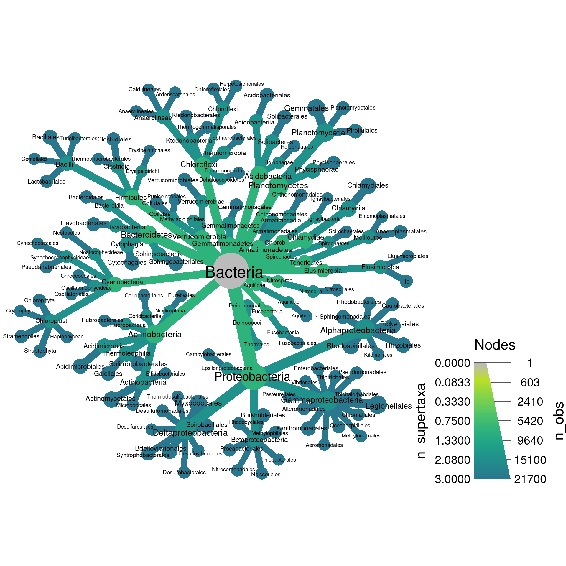
Note how both sides of the legend on the bottom right have numbers now. The left side is the color legend and the right is the size legend.
Setting edge attributes
Just like the node size/color, the edge size/color can be used to display statistics. Edges can also have labels. This means you can plot 4 statistics in one graph, although more than 3 is typically overwhelming. However, we need some more things to graph, so we will calculate the number of reads in each taxon, grouping samples by leaf/root samples.
obj$data$tax_abund <- calc_taxon_abund(obj, "otu_counts",
                                       cols = sample_data$SampleID,
                                       groups = sample_data$Type)
## Summing per-taxon counts from 292 columns in 2 groups for 704 taxaprint(obj$data$tax_abund)## # A tibble: 704 × 3
## taxon_id leaf root
## <chr> <dbl> <dbl>
## 1 aad 9756557 14913548
## 2 aaf 6453231 6545249
## 3 aag 986779 4018650
## 4 aah 449603 220102
## 5 aai 1640232 1629309
## 6 aaj 29798 76133
## 7 aak 18195 442261
## 8 aal 20625 503211
## 9 aam 10398 220376
## 10 aan 68473 738385
## # … with 694 more rows
Since the “leaf” and “root” columns have one value per taxon, they can be used for plotting. We can set the root read counts to the node color and the leaf read counts to the edge color.
set.seed(2) # Each number will produce a slightly different result for some layouts
obj %>%
  filter_taxa(grepl(pattern = "^[a-zA-Z]+$", taxon_names)) %>% # remove "odd" taxa
  filter_taxa(taxon_ranks == "o", supertaxa = TRUE) %>% # subset to the class rank
  heat_tree(node_label = taxon_names,
            node_size = n_obs,
            node_color = root,
            edge_color = leaf,
            initial_layout = "re", layout = "da",
            output_file = "plot_example.pdf")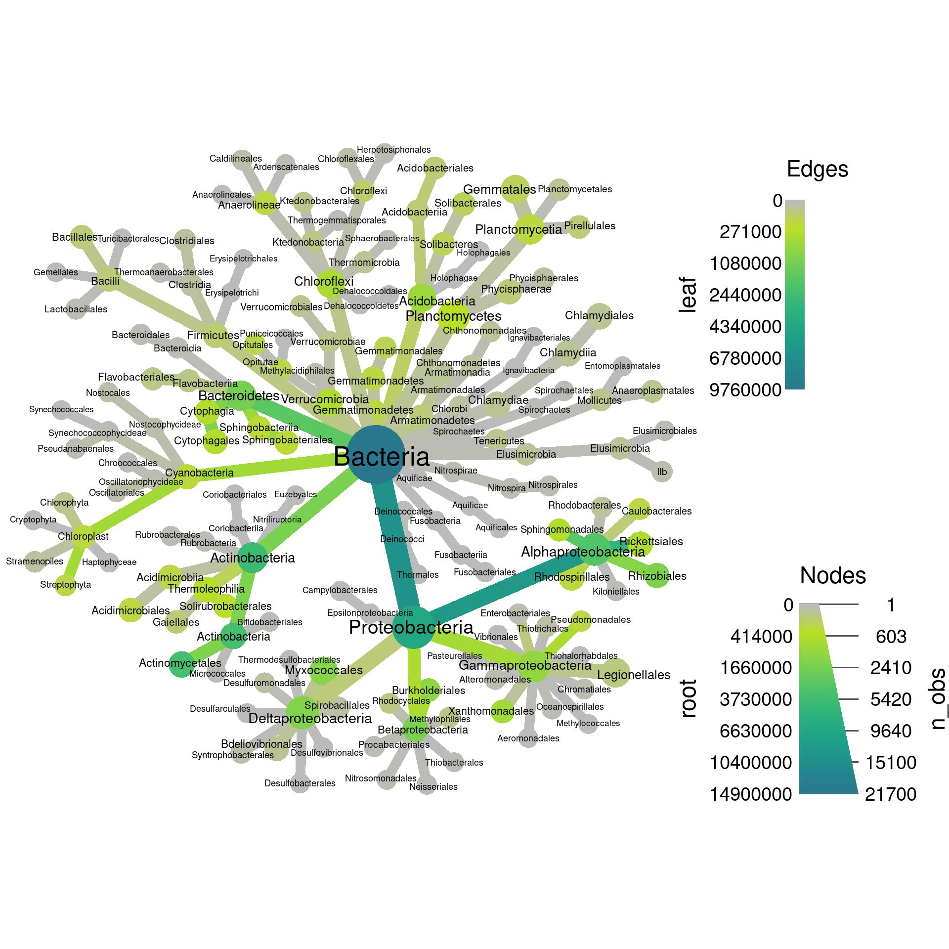
Note how there are two legends now, one for edge color/size and one for node color/size. We can also add labels to the edges. For example, we can print the number of OTUs assigned to each taxon like so:
set.seed(2) # Each number will produce a slightly different result for some layouts
obj %>%
  filter_taxa(grepl(pattern = "^[a-zA-Z]+$", taxon_names)) %>% # remove "odd" taxa
  filter_taxa(taxon_ranks == "o", supertaxa = TRUE) %>% # subset to the class rank
  heat_tree(node_label = taxon_names,
            node_size = n_obs,
            node_color = root,
            edge_label = n_obs,
            initial_layout = "re", layout = "da",
            output_file = "plot_example.pdf")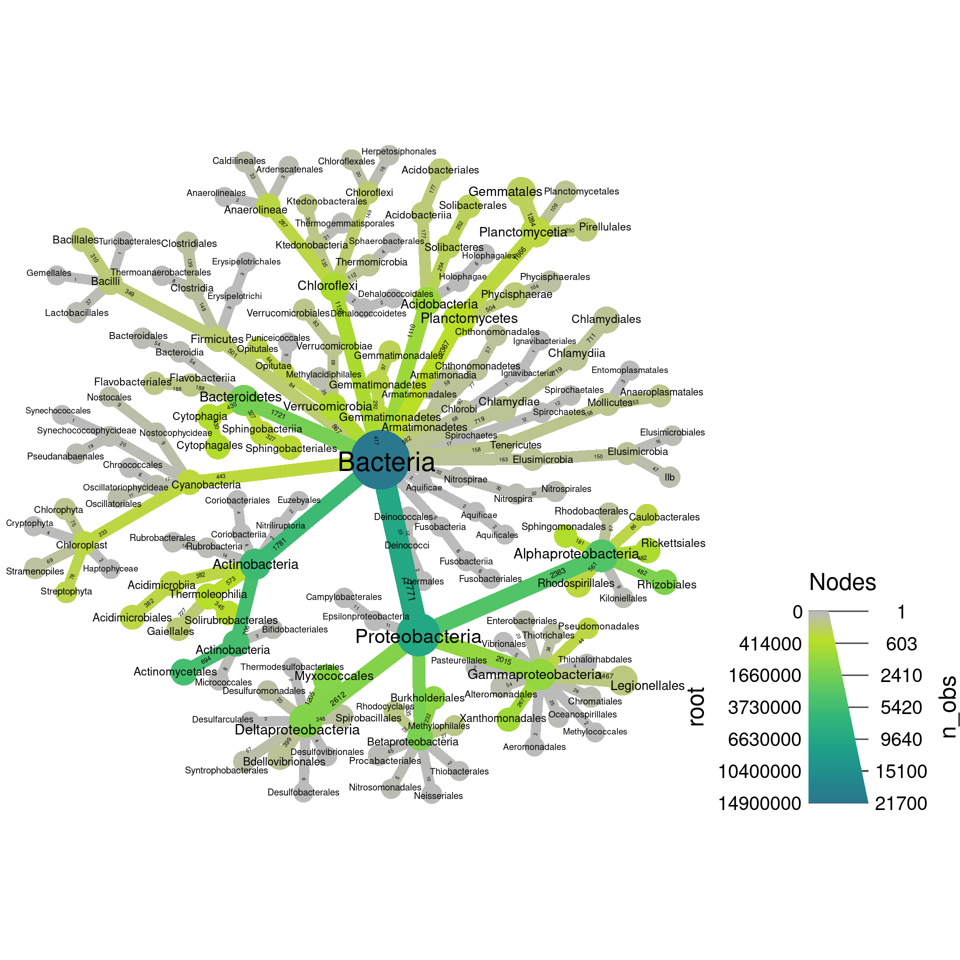
Setting titles and legend lables
You can add a title to the graph and change the legend labels to make
the graph easier to understand, using the title option and
options ending in _axis_label.
set.seed(2) # Each number will produce a slightly different result for some layouts
obj %>%
  filter_taxa(grepl(pattern = "^[a-zA-Z]+$", taxon_names)) %>% # remove "odd" taxa
  filter_taxa(taxon_ranks == "o", supertaxa = TRUE) %>% # subset to the class rank
  heat_tree(node_label = taxon_names,
            node_size = n_obs,
            node_color = root,
            initial_layout = "re", layout = "da",
            title = "Root sample read depth",
            node_color_axis_label = "Sum of root reads",
            node_size_axis_label = "Number of OTUs",
            output_file = "plot_example.pdf")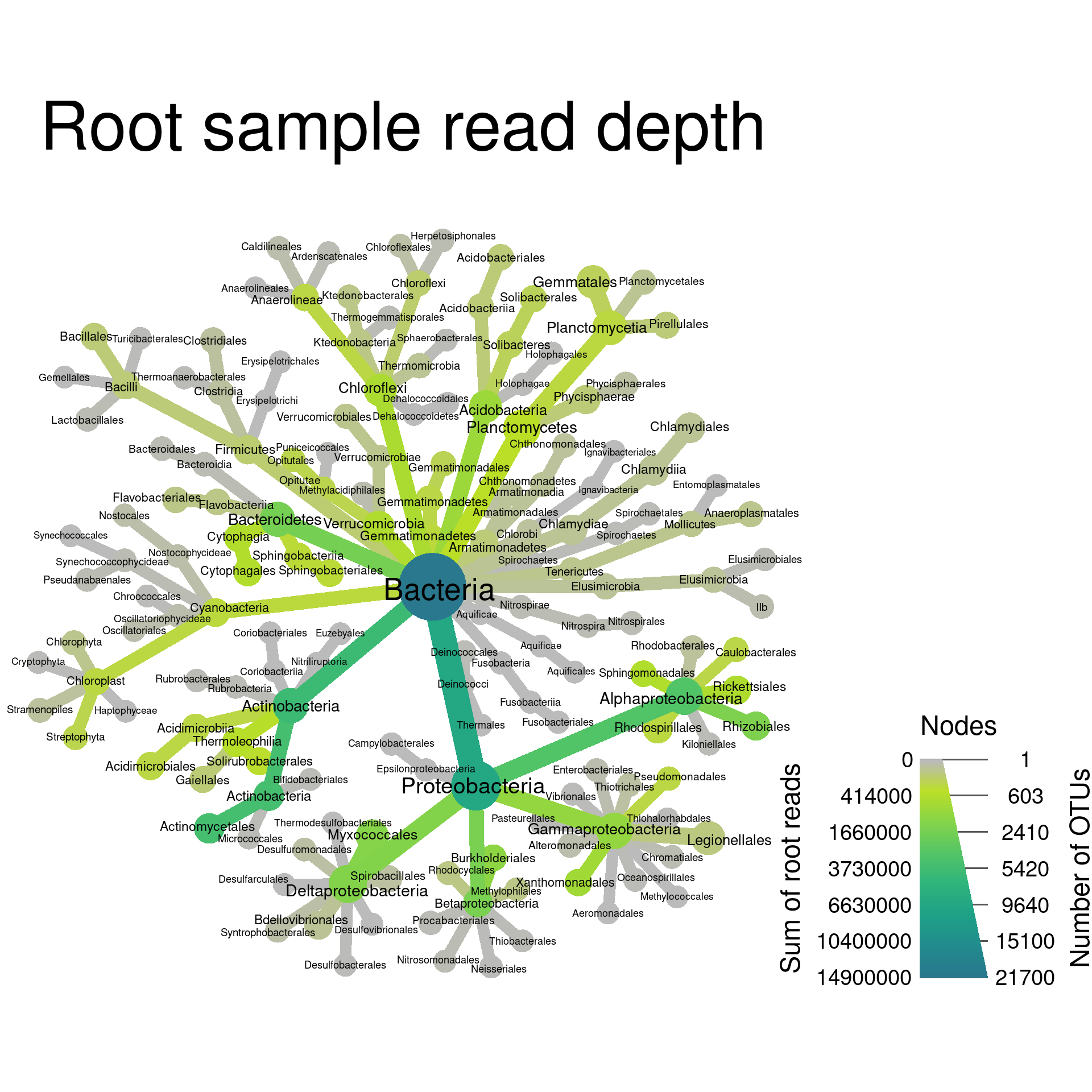
There are similar options for the edge color and edge size.
Changing the colors used
You can change the colors used in the plot using the
node_color_range and edge_color_range options.
These accept two or more colors, either as common color names
(e.g. c("red", "green")) or
hexadecimal
color codes (e.g. #000000 is black).
set.seed(2) # Each number will produce a slightly different result for some layouts
obj %>%
  filter_taxa(grepl(pattern = "^[a-zA-Z]+$", taxon_names)) %>% # remove "odd" taxa
  filter_taxa(taxon_ranks == "o", supertaxa = TRUE) %>% # subset to the class rank
  heat_tree(node_label = taxon_names,
            node_size = n_obs,
            node_color = root,
            node_color_range = c("red", "yellow", "green", "blue"),
            initial_layout = "re", layout = "da",
            title = "Root sample read depth",
            node_color_axis_label = "Sum of root reads",
            node_size_axis_label = "Number of OTUs",
            output_file = "plot_example.pdf")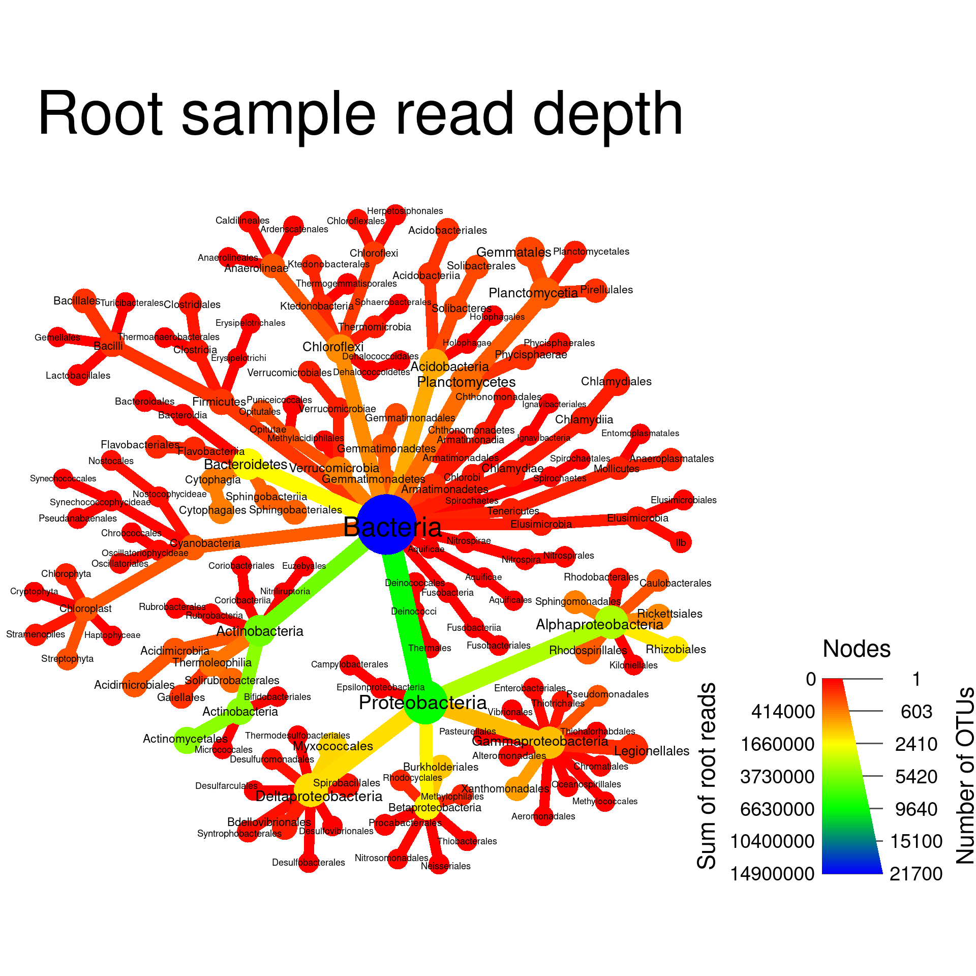
Changing the size of elements
By default, the size of nodes, edges, and labels are automatically
optimized to avoid overlaps while maximizing apparent size differences.
You can also force these to be a specific size range. For example,
node_size_range = c(0.01, 0.02) means that the largest node
will be 2% of the graph’s width and the smallest will be 1% of the
graph’s width. There are analogous options for edges and labels. Lets
use this to make the smallest nodes smaller and make all edges the same
size.
set.seed(2) # Each number will produce a slightly different result for some layouts
obj %>%
  filter_taxa(grepl(pattern = "^[a-zA-Z]+$", taxon_names)) %>% # remove "odd" taxa
  filter_taxa(taxon_ranks == "o", supertaxa = TRUE) %>% # subset to the class rank
  heat_tree(node_label = taxon_names,
            node_size = n_obs,
            node_size_range = c(0.01, 0.05),
            edge_size_range = c(0.005, 0.005),
            node_color = root,
            initial_layout = "re", layout = "da",
            title = "Root sample read depth",
            node_color_axis_label = "Sum of root reads",
            node_size_axis_label = "Number of OTUs",
            output_file = "plot_example.pdf")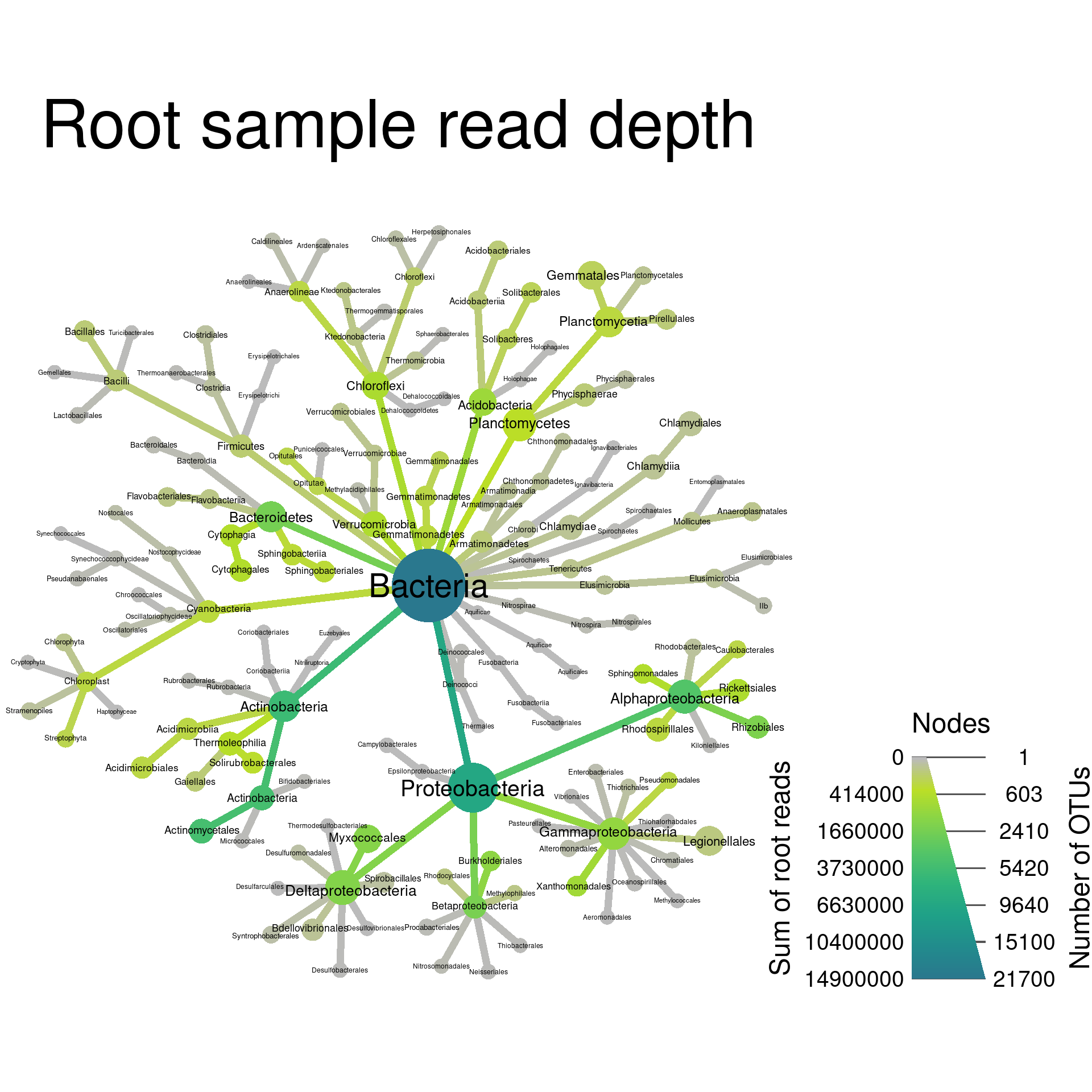
Trees with multiple roots
In all the trees we have made so far have a single “root”. A “root” is a taxon without a supertaxon. Common examples of roots in taxonomy databases include coarse taxa like “fungi”, “bacteria”, or “cellular organisms”. When a taxonomy has multiple roots, multiple trees are graphed in the same plot. We can force multiple roots to demonstrate this by selecting some taxa without preserving supertaxa:
set.seed(1) # Each number will produce a slightly different result for some layouts
obj %>%
  filter_taxa(grepl(pattern = "^[a-zA-Z]+$", taxon_names)) %>% # remove "odd" taxa
  filter_taxa(taxon_names %in% c("Proteobacteria", "Actinobacteria", "Firmicutes"),
              subtaxa = TRUE) %>%
  heat_tree(node_label = taxon_names,
            node_size = n_obs,
            node_color = root,
            tree_label = taxon_names,
            initial_layout = "re", layout = "da",
            title = "Root sample read depth",
            node_color_axis_label = "Sum of root reads",
            node_size_axis_label = "Number of OTUs",
            output_file = "plot_example.pdf")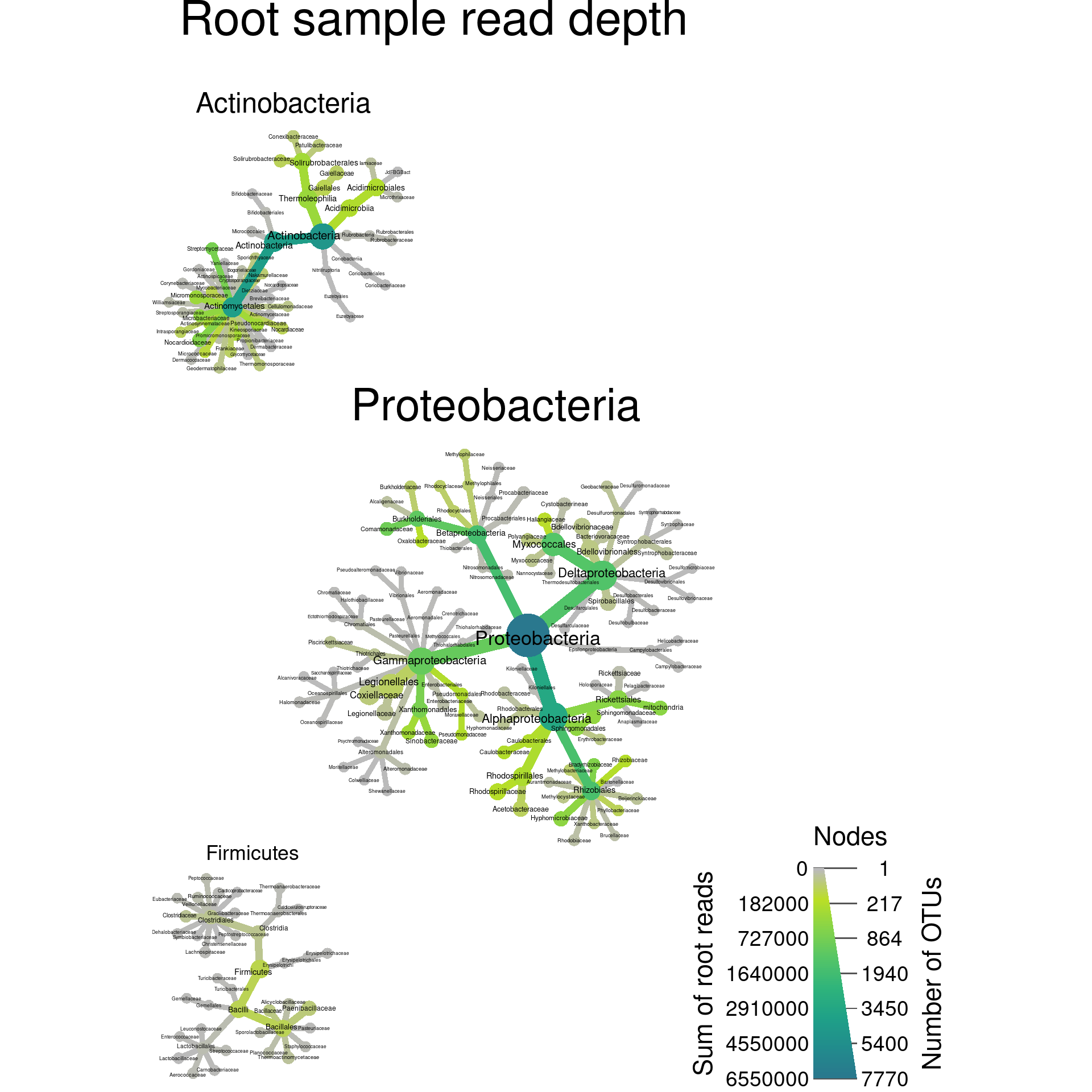
Note the use of the tree_label option used to add the
tree labels based on the name of their root taxa. This can be used to
make very large taxonomies easier to understand or emphasize differences
between taxa.
Exercises
In these exercises, we will be using the obj from the
analysis above. If you did not run the code above or had problems, run
the following code to get the objects used. You can download the
“plotting_data.Rdata” file
here.
load("plotting_data.Rdata")1a) Make a plot of Firmicutes and subtaxa with the size of nodes proportional to the number of OTUs and label the nodes with taxon names.
obj %>%
  filter_taxa(taxon_names == "Firmicutes", subtaxa = TRUE) %>%
  heat_tree(node_size = n_obs,
            node_label = taxon_names)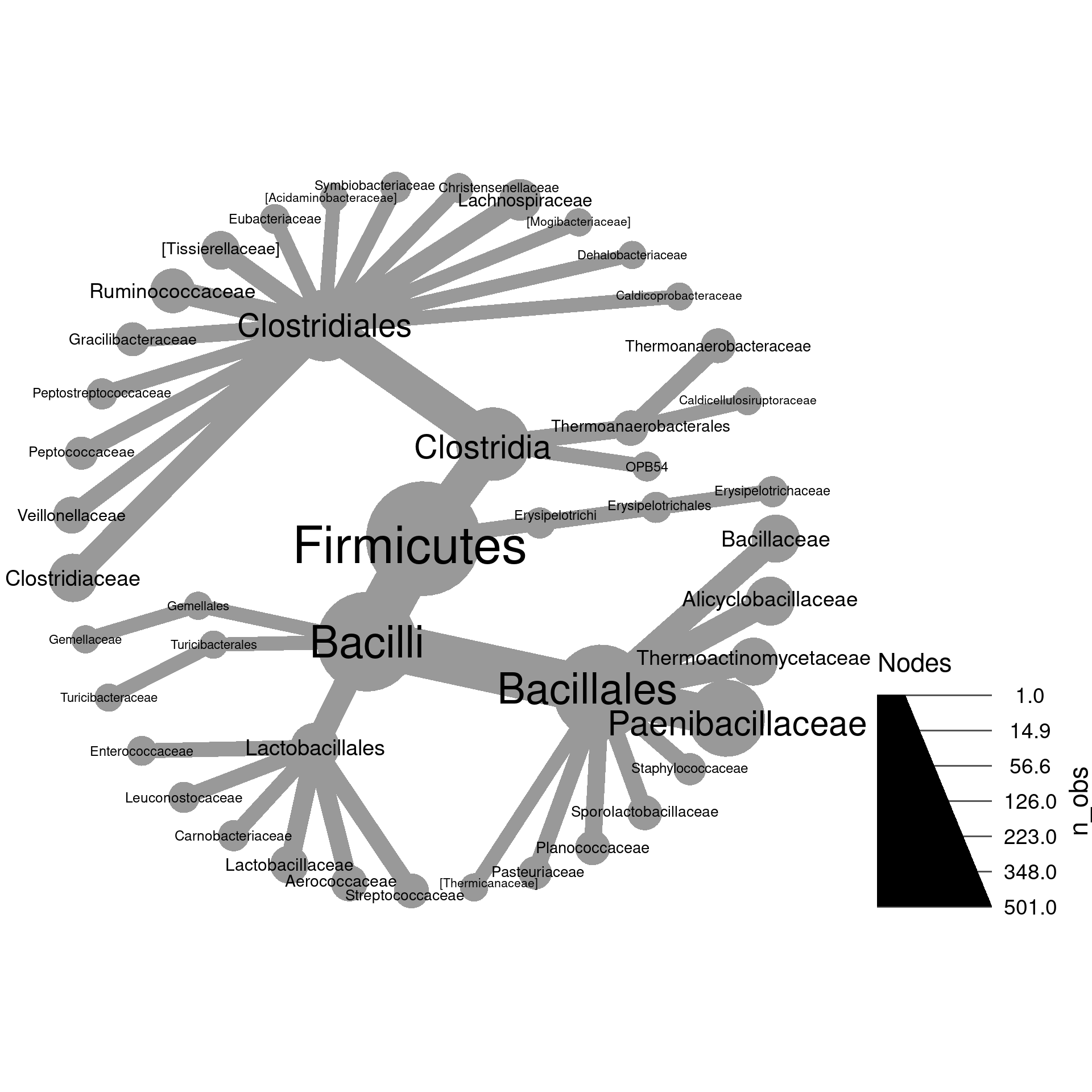
1b) Modify the plot you made in part
a so that the taxon names and OTU counts are combined
in the label like “my_taxon (123)”. Hint: try paste0 to
combine multiple pieces of text.
obj %>%
  filter_taxa(taxon_names == "Firmicutes", subtaxa = TRUE) %>%
  heat_tree(node_size = n_obs,
            node_label = paste0(taxon_names, " (", n_obs, ")"))
2a) The function n_subtaxa returns the
number of taxa each taxon has within it:
head(n_subtaxa(obj))## aad aaf aag aah aai aaj
## 703 164 71 28 38 46
Like, the taxon_names and n_obs functions,
this returns one value per taxon, so is useful for plotting heat trees.
Try to make a tree of only Proteobacteria and its subtaxa where
the size of nodes is proportional to the number of subtaxa. Label the
nodes by taxon names.
obj %>%
  filter_taxa(taxon_names == "Proteobacteria", subtaxa = TRUE) %>%
  heat_tree(node_size = n_subtaxa,
            node_label = taxon_names)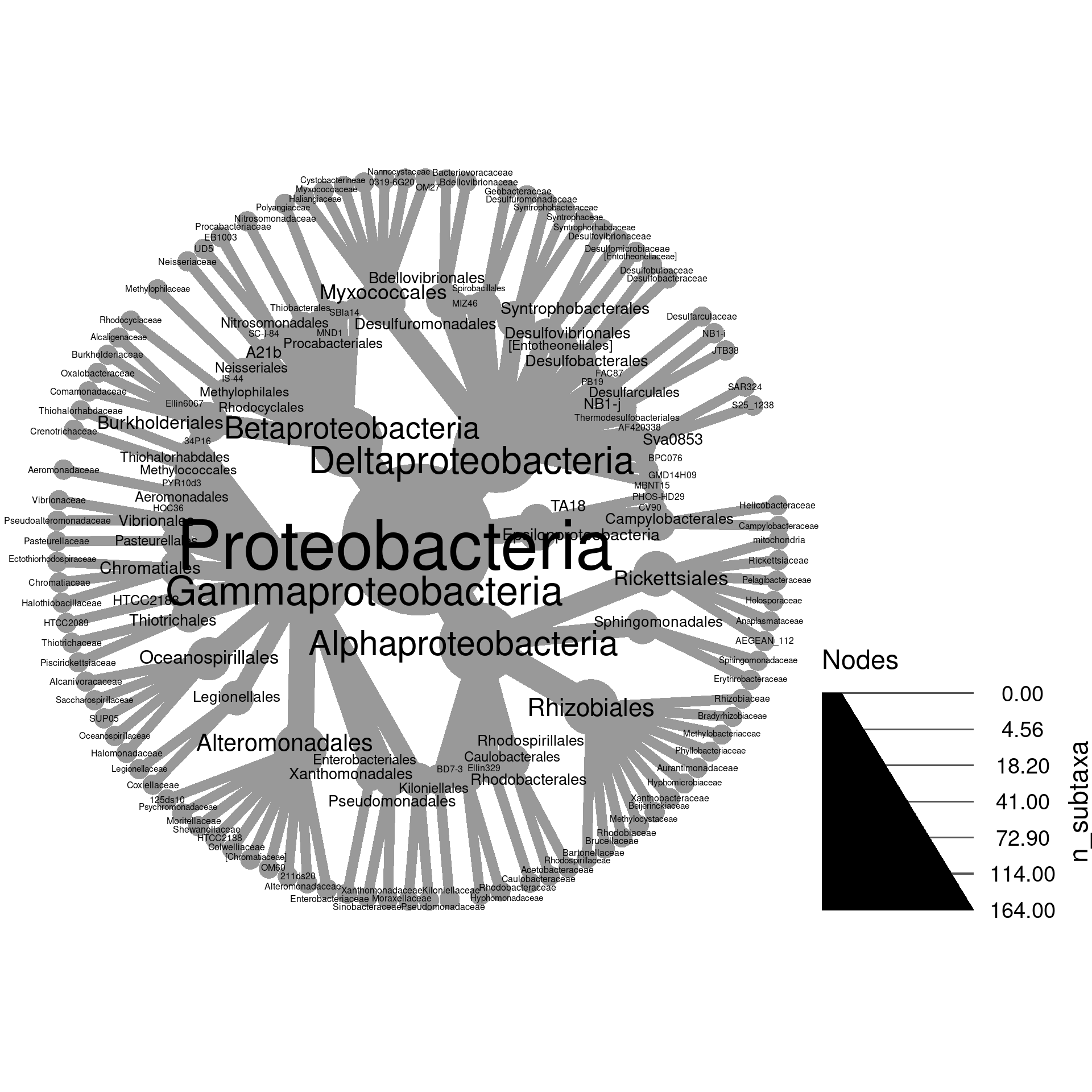
2b) heat_tree has an option called
node_size_range to force node sizes to be in a specified
range instead of letting the function pick the maximum and minimum size.
Remake the graph for a, but use
node_size_range to make the node sizes vary between 0.5%
and 5% of the graph width.
obj %>%
  filter_taxa(taxon_names == "Proteobacteria", subtaxa = TRUE) %>%
  heat_tree(node_size = n_subtaxa,
            node_label = taxon_names,
            node_size_range = c(0.005, 0.05))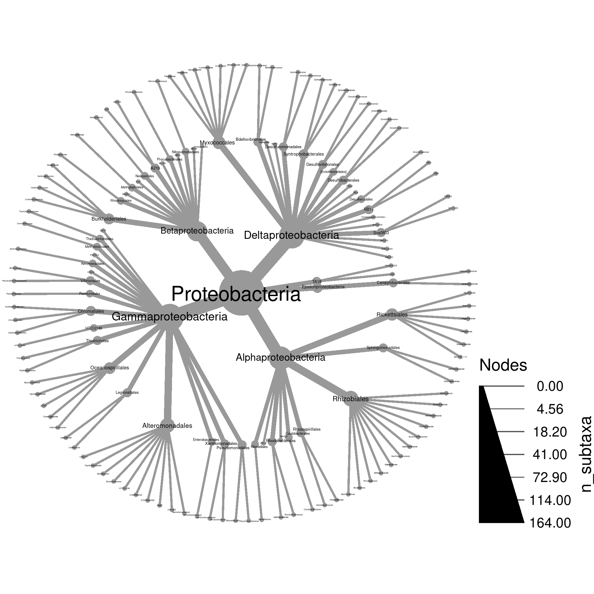
2c) This made the node labels in the tips too small
to read. We can also force the labels to be a specified range of sizes.
Use the node_label_size_range option to make the tips
readable without cluttering the graph too much.
obj %>%
  filter_taxa(taxon_names == "Proteobacteria", subtaxa = TRUE) %>%
  heat_tree(node_size = n_subtaxa,
            node_label = taxon_names,
            node_size_range = c(0.005, 0.05),
            node_label_size_range = c(0.008, 0.04))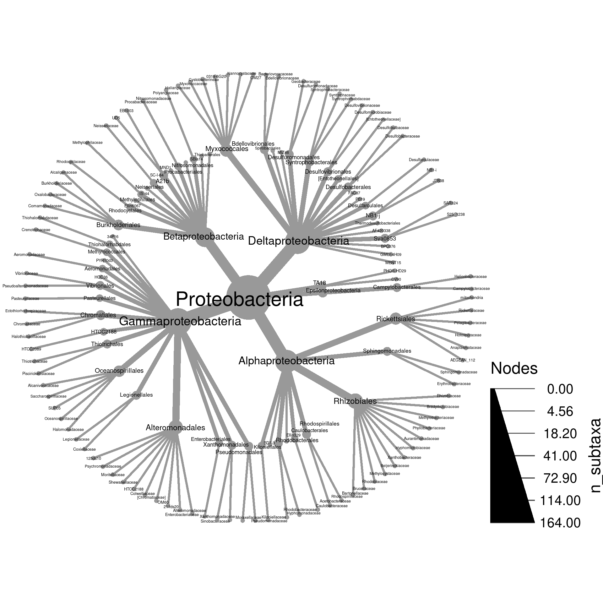
3a) Using the “root” and “leaf” columns in the “tax_abund” table created earlier in this section for this example, plot the number of reads in leaf samples in “Proteobacteria” and subtaxa using the size and color of nodes. Label the nodes with taxon names.
obj %>%
  filter_taxa(taxon_names == "Proteobacteria", subtaxa = TRUE) %>%
  heat_tree(node_size = leaf,
            node_color = leaf,
            node_label = taxon_names)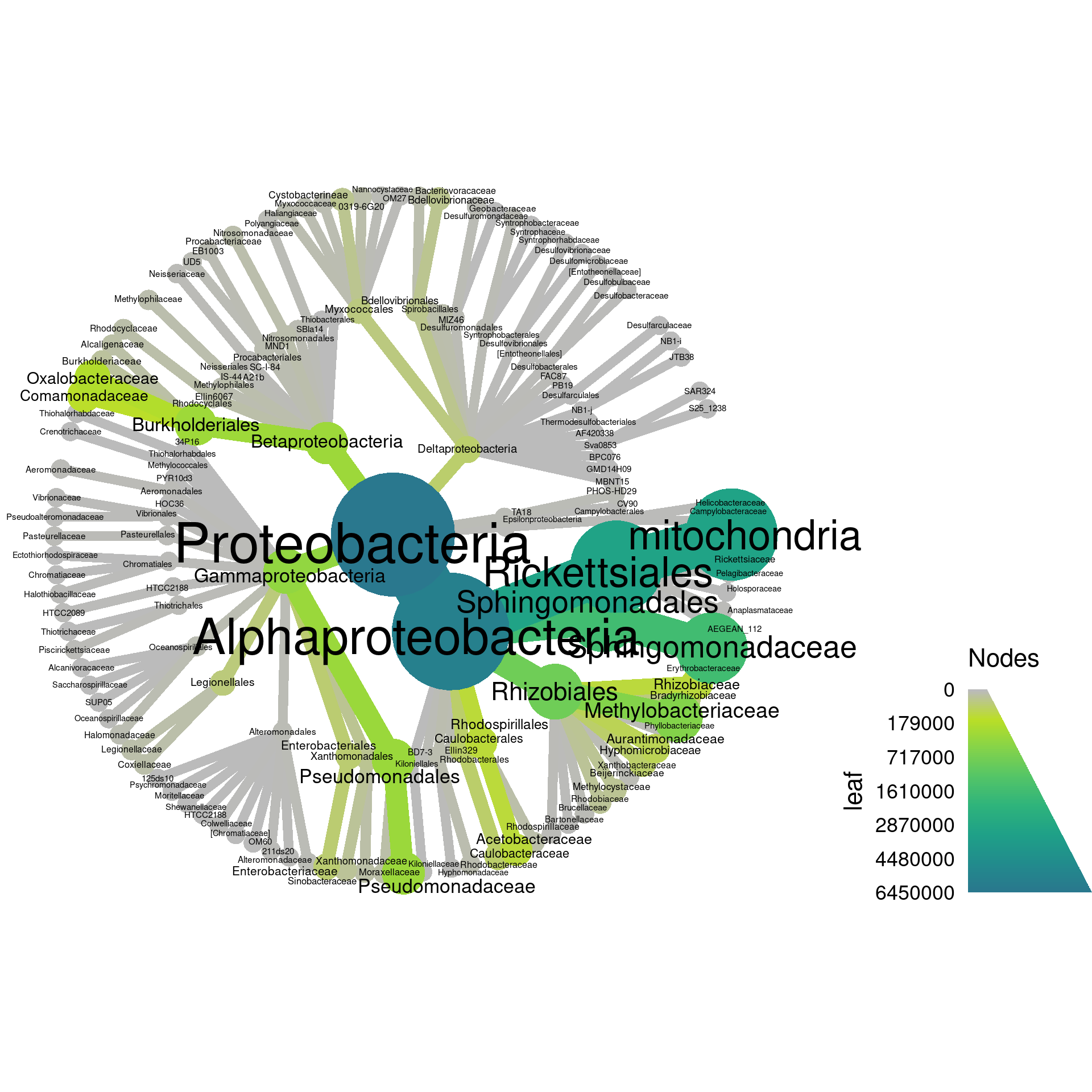
3b) Which taxon at the tip of the tree had the most reads in leaf samples?
3c) Try to adjust the plot you made in part
a to remove any taxa with less than 100 reads. Hint:
this can be done with filter_taxa.
obj %>%
  filter_taxa(taxon_names == "Proteobacteria", subtaxa = TRUE) %>%
  filter_taxa(leaf >= 100) %>%
  heat_tree(node_size = leaf,
            node_color = leaf,
            node_label = taxon_names)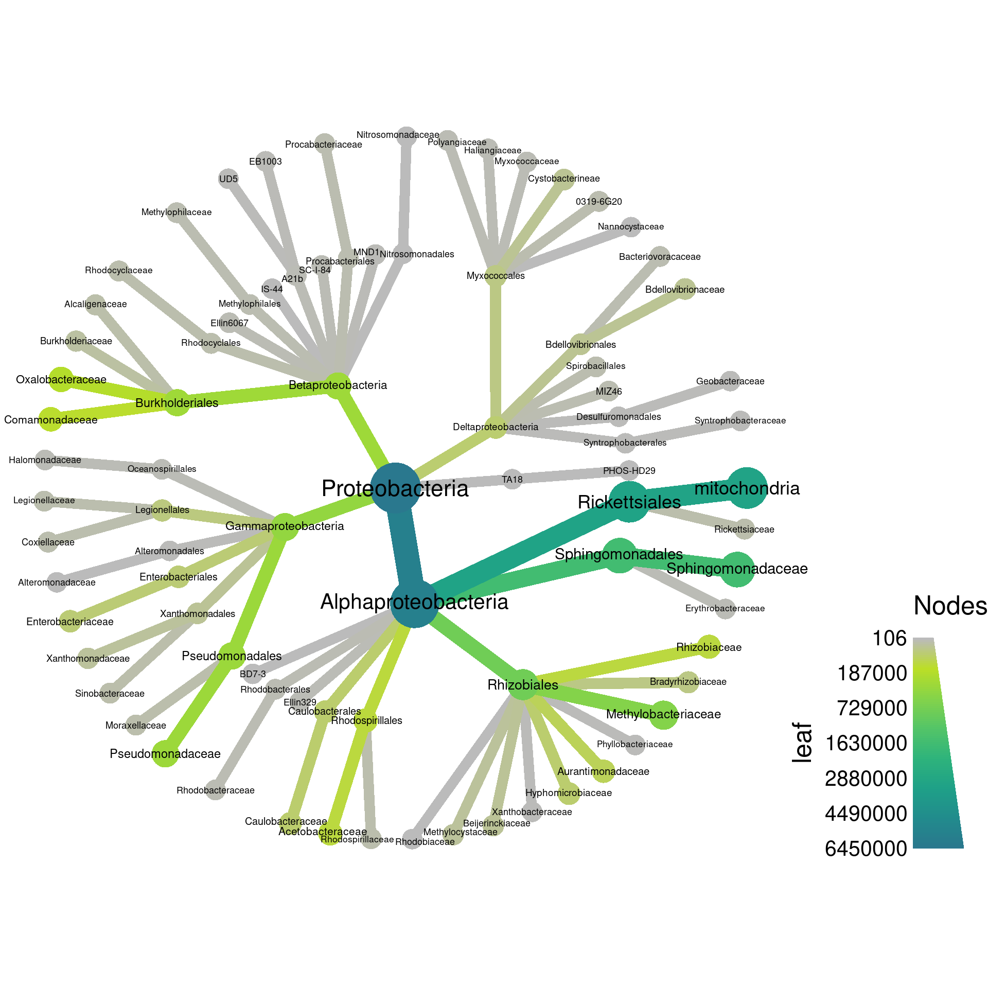
4a) In addition to automatically coloring taxa to represent a number (e.g. OTU count), you can specify the color of each taxon using common color names (e.g. “red” or “blue”) or hexadecimal color codes (e.g. “#000000” for black). You can either supply a single color to color everything the same or a vector of colors (e.g. c(“red”, “blue”, …)) with one value for each taxon.
Try to plot Actinobacteria and subtaxa with node size
correlating with number of reads in root samples. Color all edges a
light blue. Enter colors() to see the list of named colors
that can be used.
obj %>%
  filter_taxa(taxon_names == "Firmicutes", subtaxa = TRUE) %>%
  heat_tree(node_size = root,
            edge_color = "skyblue", # Other colors also correct
            node_label = taxon_names)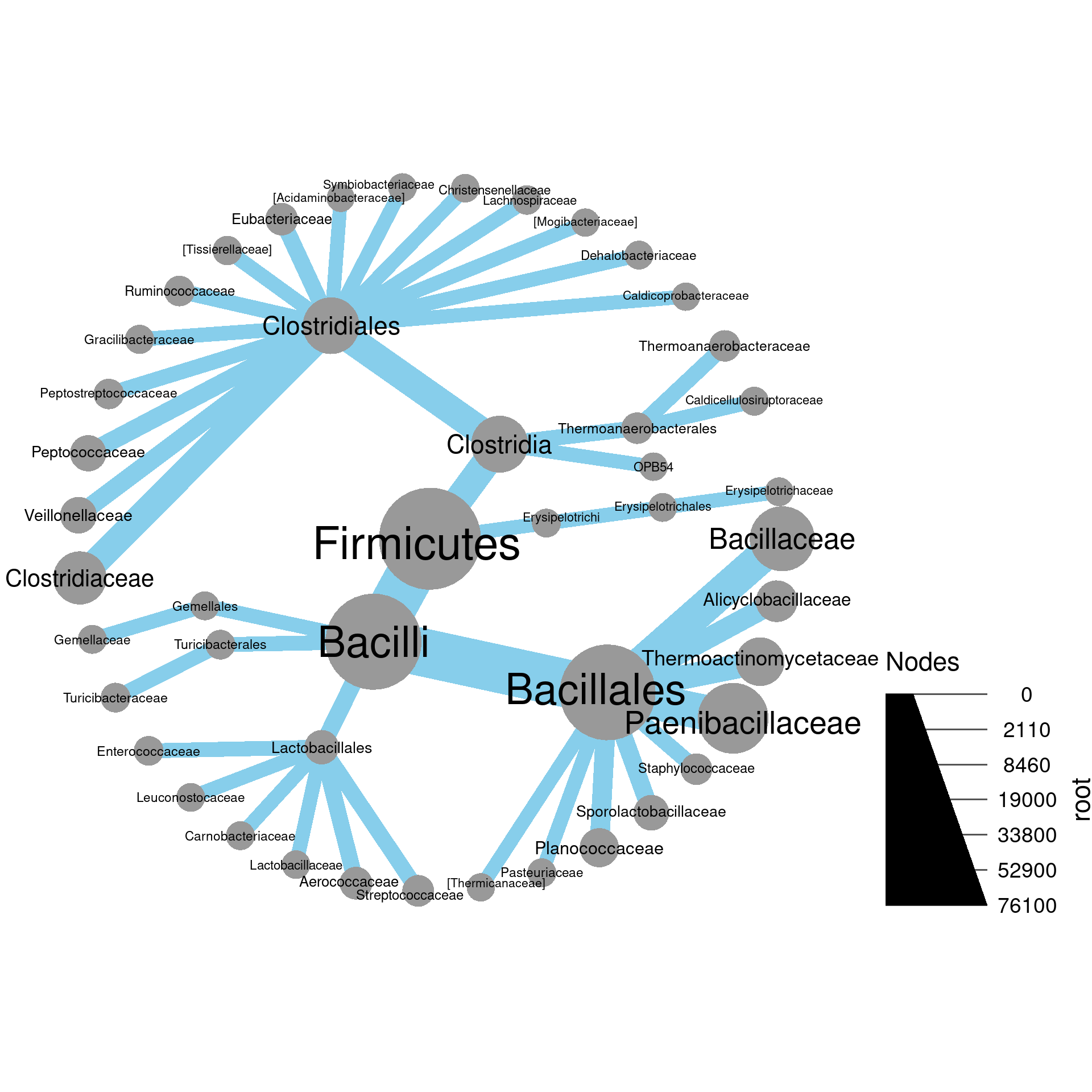
4b) Modify the command from part a
so that all taxa on the tips (i.e. “leafs”) are colored green and the
rest are grey Hint: the is_leaf and ifelse
functions might be useful. See the help page for these functions
(e.g. Type ?is_leaf).
obj %>%
filter_taxa(taxon_names == "Firmicutes", subtaxa = TRUE) %>%
heat_tree(node_size = leaf,
edge_color = "skyblue", # Other colors also correct
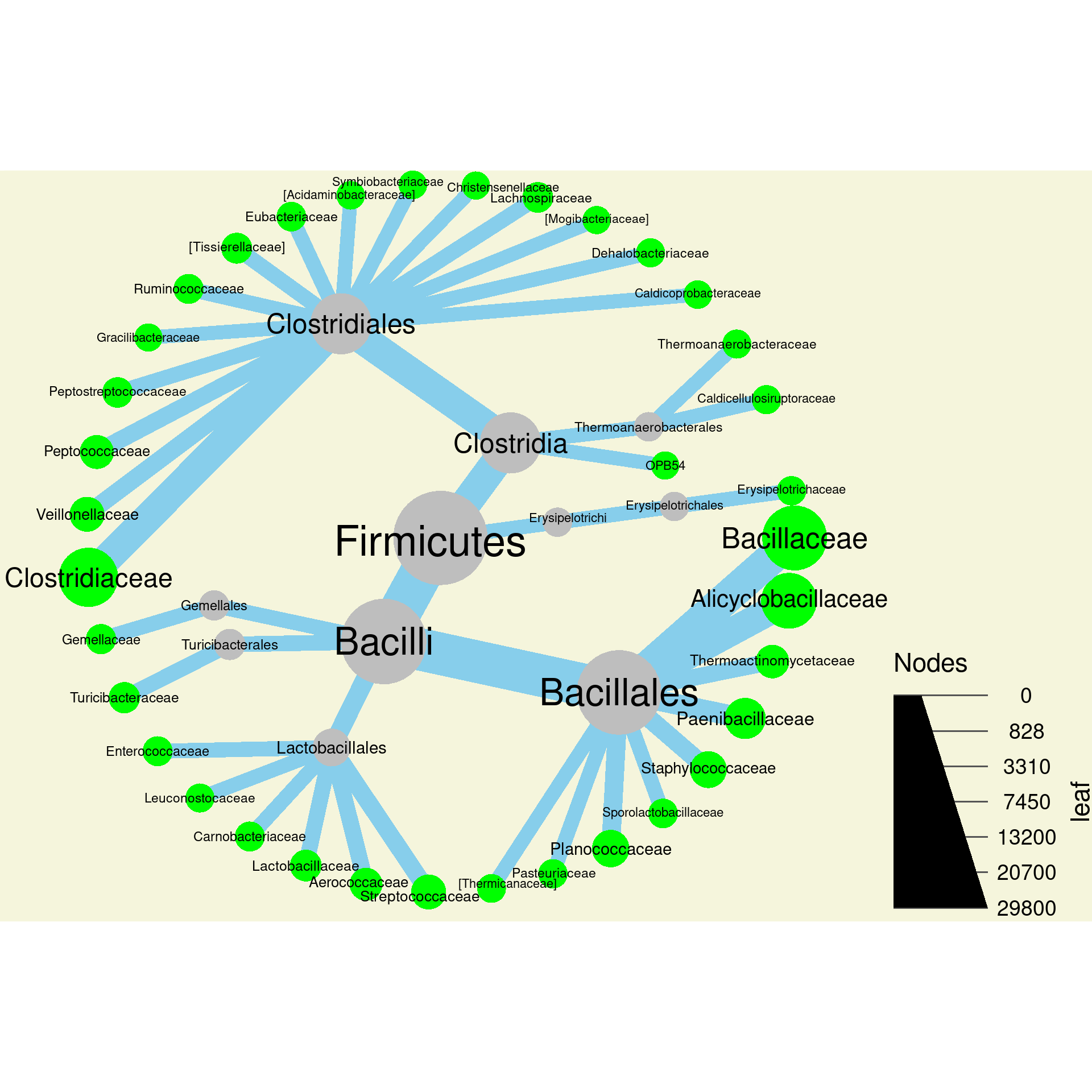
node_color = ifelse(is_leaf, "green", "grey"),
node_label = taxon_names)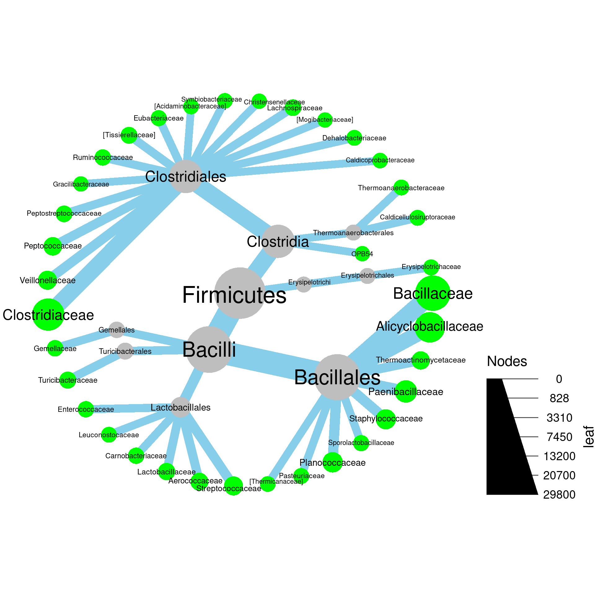
4c) Modify the command from part b
to make the background of the plot beige. Look at the help pages for
heat_tree (Type ?heat_tree) to figure out what
option to use.
obj %>%
  filter_taxa(taxon_names == "Firmicutes", subtaxa = TRUE) %>%
  heat_tree(node_size = leaf,
            edge_color = "skyblue", # Other colors also correct
            node_color = ifelse(is_leaf, "green", "grey"),
            node_label = taxon_names,
            background_color = "beige")